Making troubleshooting for networks 3x faster
Designing a dashboard for IT administrators managing networks
Client
Cloud-based Network Management Platform
Role
Lead Product Designer
Platforms
Desktop

The Brief
About the Client
Highway9 built a platform that helps enterprises set up and manage private 5G and LTE networks, covering everything from in-building coverage to edge infrastructure. I joined right after they came out of stealth, when they were growing fast.
Challenge
Highway9's early product had a single dashboard serving all users: CIOs, IT Admins, and Engineers alike. As the product grew and client deployments became more complex, the limits of that approach became clear.
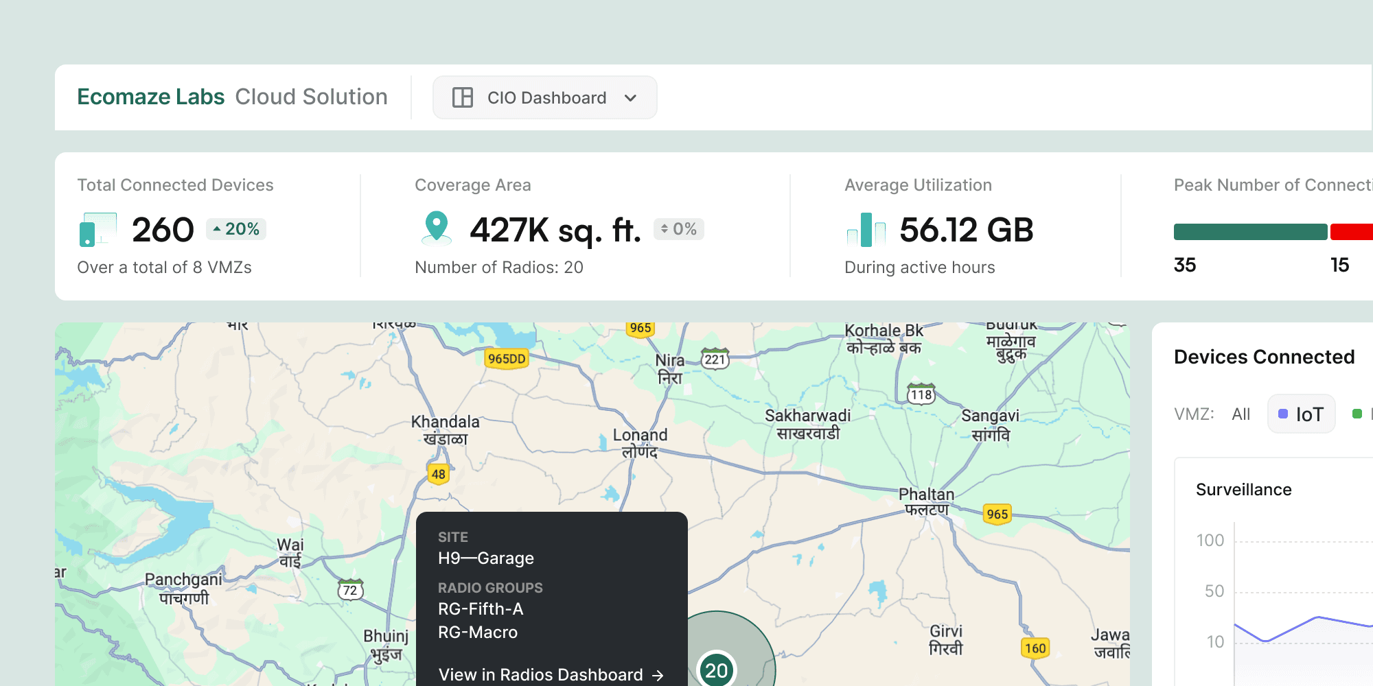
A CIO looking for network growth trends and an IT Admin diagnosing a device outage need fundamentally different information, at different levels of detail, on different timescales. The IT Admin in particular, responsible for monitoring device health, diagnosing incidents, and maintaining network infrastructure across locations, was stuck working against a dashboard built for executive oversight.
Solution
Design a purpose-built operational dashboard that actually matched the IT Admin's real workflow.
The Process
Persona & Stakeholder Mapping
I started by creating a persona for the primary users: on-site engineers, IT and network administrators, and other technical staff responsible for maintaining infrastructure at client locations.
Through stakeholder discussions, I mapped out the information and workflows they'd need, focused on how they diagnose problems, monitor device health, and respond to incidents.
Competitor Research
There were no direct competitors offering a similar solution, so I looked at adjacent domain tools instead, to understand common interaction patterns and find opportunities to improve on them.
Information Architecture & Initial Explorations
The IA was developed collaboratively with the engineering team, balancing clarity with the operational depth Admins actually needed. The persona work and competitor research fed directly into these decisions.
Explorations & Iterations
Visualizing the network
The biggest layout iteration was how to show the network infrastructure itself. A list format came first: straightforward, but flat, with no sense of device relationships or spatial context. A tree map came next, which was a component they had already used in another screen. It improved the hierarchy but still felt abstract for physical infrastructure.
The Network Map came out of a third round of exploration, mapping devices as nodes across a location. It immediately felt more natural and gave Admins the spatial context to understand the impact of an issue at a glance.
Placing the timeline
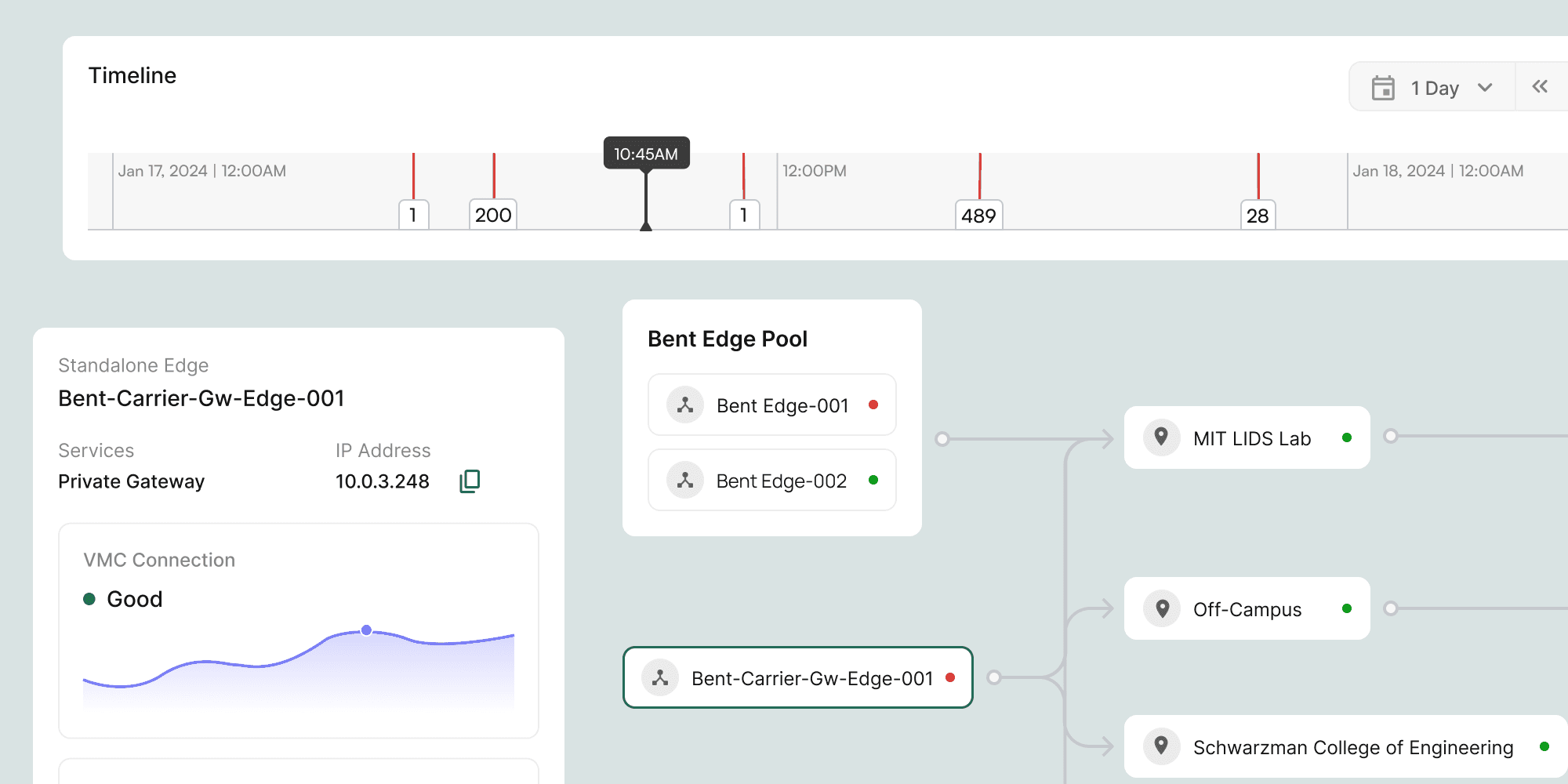
Early layouts placed the timeline mid-page, as one panel among several. But feedback kept pointing to it as the most critical starting point for any investigation, so it moved to the top of the dashboard as the primary anchoring element.
Key Design Decisions
IT Admins do not think in terms of snapshots. They think in sequences of events. When something goes wrong, the first question is always: what changed, and when? We placed a timeline-based view at the top of the dashboard as the primary navigation surface, with critical network events highlighted within it. This mirrors how Admins actually investigate incidents, rather than asking them to adapt their mental model to a conventional dashboard layout.

Early wireframes explored showing the network infrastructure as a list and as a tree map. Both worked informationally but missed something important: the spatial relationship between devices at a location matters to an Admin trying to understand the blast radius of an issue. The Network Map visualisation, showing devices as nodes across a location, made device status legible in the context of the surrounding infrastructure.

Right-panel detail view instead of navigating away
A persistent details panel on the right, contextually surfacing metrics and charts for the selected device, kept Admins oriented during investigation. Navigating to a separate device view broke situational awareness by removing the timeline and network map from view at the moment an Admin needed them most. The panel approach meant Admins could assess a device's status without losing the broader incident context.
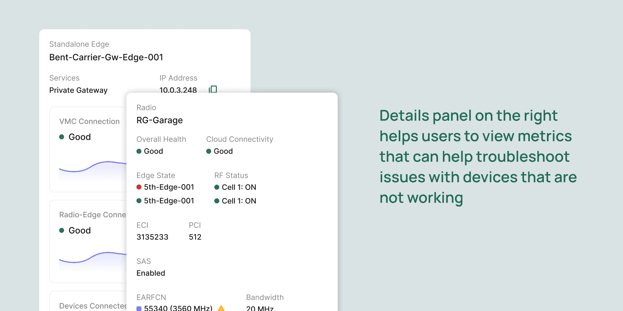
Detailed diagnostic data is available, but behind an explicit drill-down action. Most operational checks do not require full diagnostics, and surfacing that depth by default would have recreated the same cognitive overload the dashboard was designed to solve. The design rewards shallow investigation first, with depth available on demand.

Final Designs
High-fidelity screens covering all 8 configuration flows plus a new device-addition flow. Full-width layout, persistent contextual help, non-linear navigation. The same system later replaced the old settings screens across the rest of the product.

Key Outcomes & Impact
Faster troubleshooting
3x reduction troubleshooting time
The initial method involved looking at all the products in the Edges & Radios dashboard, and checking status for each device manually for that time range. This exercise would take 20-30 minutes, and can now be done in 10 mins.