
Designing a Dashboard for an IT Admin
Turning a one-size-fits-all dashboard into a focused operational tool, giving IT Admins real-time situational awareness across a 5G enterprise network
Client
Role
Lead Product Designer
Platforms
Desktop
The Problem
Highway9's early product had a single dashboard serving all users: CIOs, IT Admins, and Engineers alike. As the product grew and client deployments became more complex, the limits of that approach became clear. A CIO looking for network growth trends and an IT Admin diagnosing a device outage need fundamentally different information, at different levels of detail, on different timescales.
The IT Admin in particular, responsible for monitoring device health, diagnosing incidents, and maintaining network infrastructure across locations, was working against a dashboard built for executive oversight. The brief was to design a purpose-built operational dashboard that matched the Admin's actual workflow.

Key Design Decisions


Process
I began by creating a persona to represent the primary users: on-site engineers, IT and network administrators, and other technical staff responsible for maintaining network infrastructure at client locations. Through stakeholder discussions, I mapped out the information and workflows these users would require, focusing on how they diagnose problems, monitor device health, and respond to incidents.
Since there were no direct competitors offering a similar solution, I conducted a comparative analysis of adjacent domain tools to understand common interaction patterns and identify opportunities to improve on them. This fed directly into the IA, developed collaboratively with the engineering team to balance clarity with the operational depth Admins needed.
Iterations
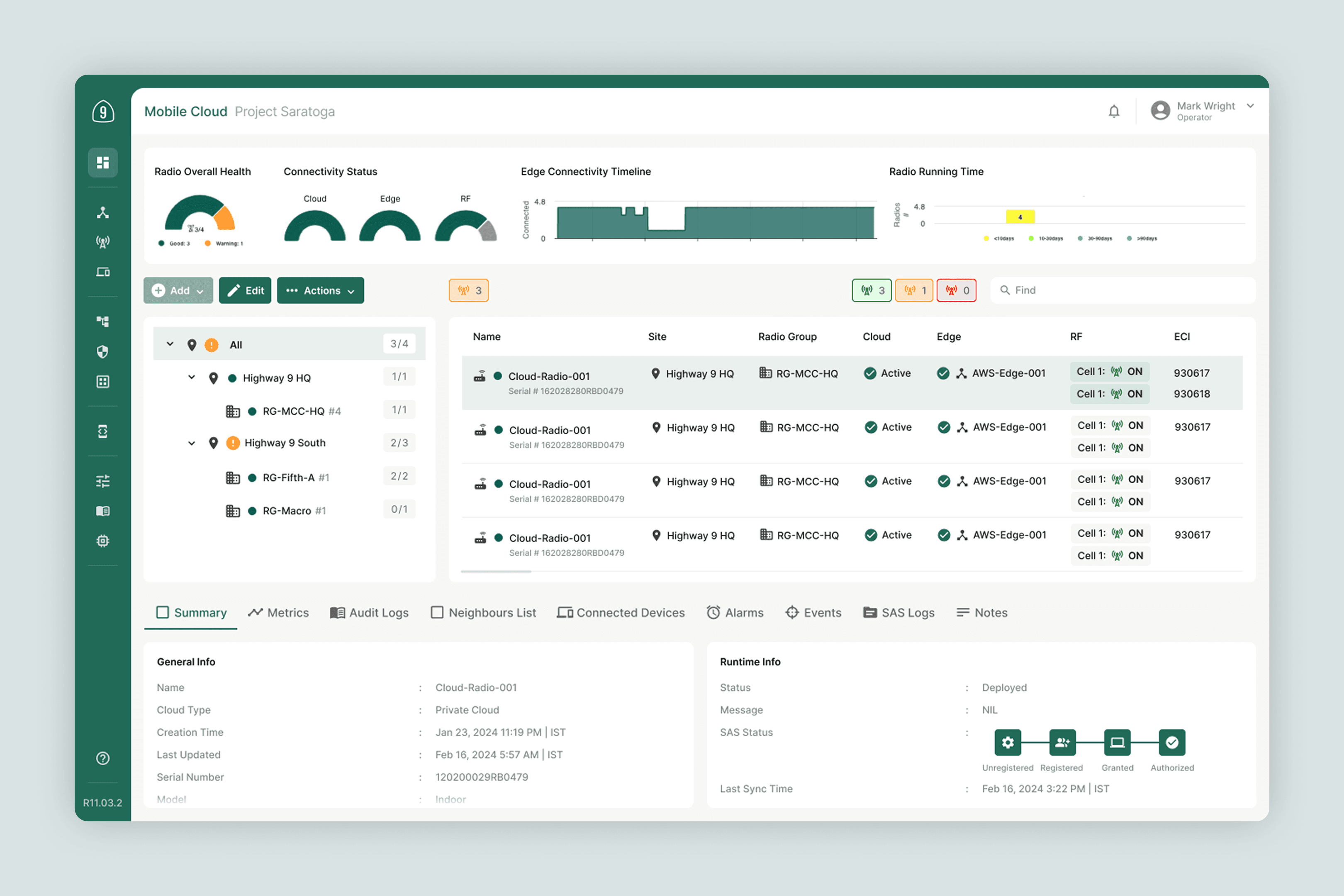
The most significant layout iteration was the visualisation of the network infrastructure itself. Initial wireframes used a list format: straightforward but flat, offering no sense of device relationships or spatial context. A tree map was explored next, which improved hierarchy but still felt abstract for physical network infrastructure. The Network Map emerged from a third round of exploration and immediately felt more natural, mapping devices as nodes across a location and giving Admins the spatial context needed to understand the impact of an issue at a glance.
The timeline placement also evolved: early layouts positioned it mid-page as one panel among several, but feedback consistently pointed to it as the most critical starting point for any investigation, leading to its promotion to the top of the dashboard as the primary anchoring element.
Final Output
A purpose-built IT Admin dashboard featuring a timeline-based event view at the top, a Network Map for infrastructure visualisation, a persistent right-panel detail view for selected devices, and a drill-down path to full device diagnostics. The dashboard was iterated on over the course of the engagement, with incremental updates to network map visuals and event filtering to manage information density.

Reflection
The biggest gap in this project was the absence of direct user research with working IT Admins. The persona and requirements were built through stakeholder conversations and comparative analysis, which gave us a solid foundation. But there is a meaningful difference between inferring Admin workflows and observing them. The Network Map decision, which turned out to be right, was made on intuition and stakeholder feedback rather than validated user behaviour. In future projects of this kind, I would advocate for even two or three contextual inquiry sessions with Admins in active network environments before committing to the primary layout model.
More Work

Cloud-based Network Management Platform
Creating a Getting Started Guide for Network Management SaaS

Singapore-based wealthtech platform
Redesigning the Brokerage Portfolio Page for a Wealthtech Platform

Cybersecurity SOC Tool Startup
Building the MVP of a Cybersecurity SOC Tool powered by Agentic AI
