Designing a portfolio page users can actually trust
Restoring user trust by going back to what worked, and building on it from there
Client
Singapore based wealth-tech platform
Role
Lead Product Designer
Platforms
Mobile

The Brief
About the Client
Syfe is a Singapore-based investment platform offering brokerage, managed portfolios, and wealth products.
Challenge
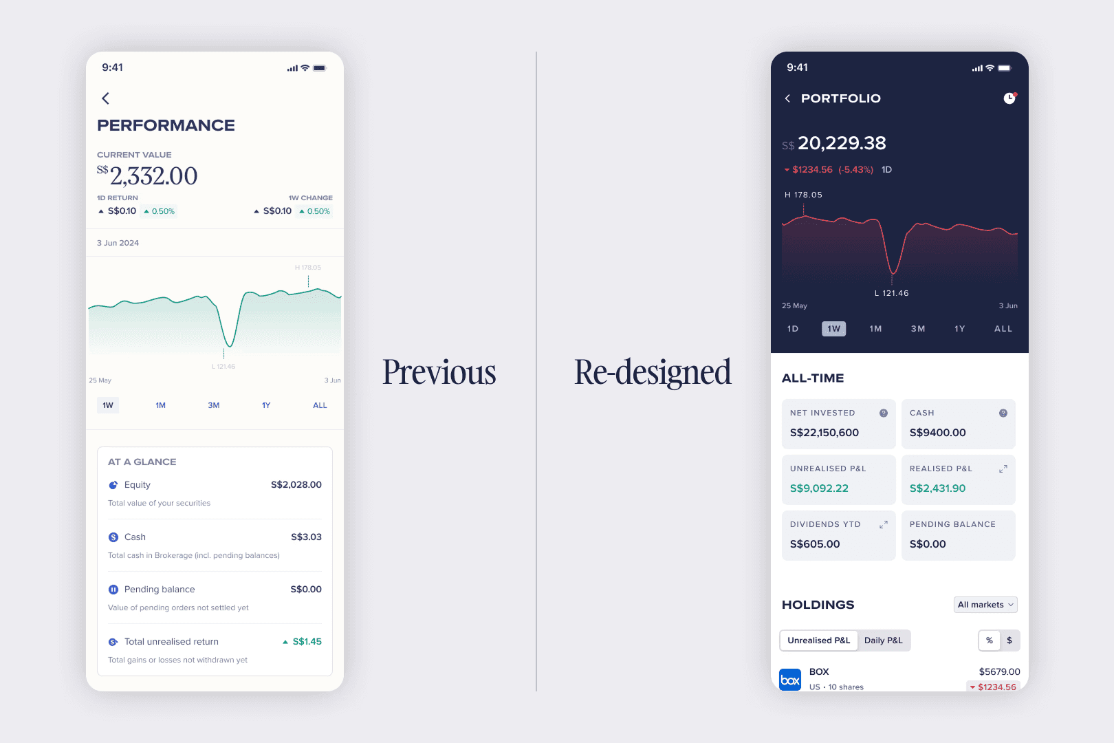
A visual language refresh replaced the existing Performance page with a new Portfolio page, and the backlash was immediate.
The graph showed only the period delta, not total portfolio value over time, so users couldn't tell if their portfolio was actually growing. The Realised P&L metric bundled dividend income with proceeds from sold assets, confusing users who hadn't sold anything. And a drastic shift in hierarchy, colour, and structure left long-time users unable to orient themselves on a page they used regularly. Users rely on this page to make sense of their money, and the drastic redesign made that harder.
Solution
Utilise the visual design of the previous version while retaining new additions such as the list of holdings and to display metrics that matter more to users.
The Process
Design Audit
I ran a structured gap analysis comparing the old Performance page against the new Portfolio page, metric by metric and layout element by layout element.
This gave a clear picture of what users had lost, what was worth keeping from the refresh, and what needed to be built net-new.
Competitor Research
To validate design directions and pressure-test assumptions, I looked at how leading brokerage and investment apps present portfolio performance, covering both international platforms and apps in the Singapore market. The focus was graph presentation, metric hierarchy, holdings layout, and navigation structure.
This pointed clearly toward showing total portfolio value as the primary graph view, rather than the period delta and it shaped which metrics actually needed to be shown to the user.
Information Architecture
The IA was rebuilt using the old Performance page as the structural base, with the refresh's new metrics mapped into the hierarchy at the right points.
Explorations & Iterations
The graph should show Total Portfolio Value
The first change to the graph was to display total portfolio value as the primary line. The previous version and the visual refresh both showed the period delta, which didn't give the user an idea of what their portfolio was worth.
Making the graph richer?
I also explored plotting an additional line to depict the total invested amount on the graph. The objective was to show a visual comparison of how much money the user invested vs the current total value of their portfolio.
Although this could potentially add value for the user, and was also seen implemented by a few competitors, while pressure testing this concept, I realised that in an event of a user removing all of their prinicipal amount and trading only with profits, the line would have to be plotted to show a negative amount. This would increase confusion for the user which is why I made the decision to leave out this visualisation as it could complicate interactions with the graph.
Metrics that matter
After gaining an understanding of the non-negotiable metrics that
Rethinking the primary navigation?
Although not part of the initial brief, I explored restructuring the navigation to put the Portfolio page in a primary tab instead of buried in the Overview sub-tab, benchmarked against how other financial apps prioritize direct access to portfolio value.
It was deprioritized due to business constraints protecting the current navigation as a cross-sell surface, but I documented a formal proposal for a future phase.
Key Design Decisions
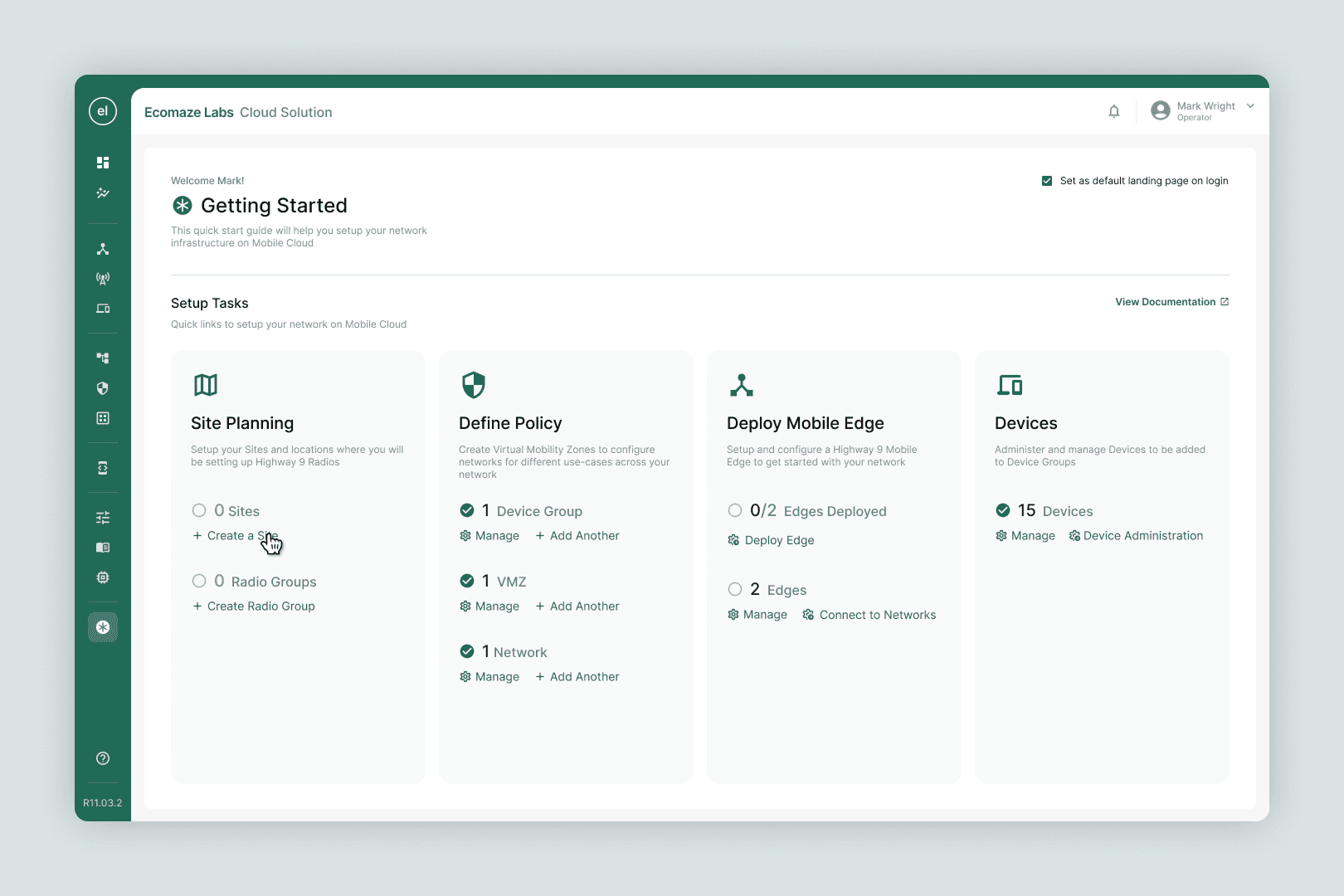
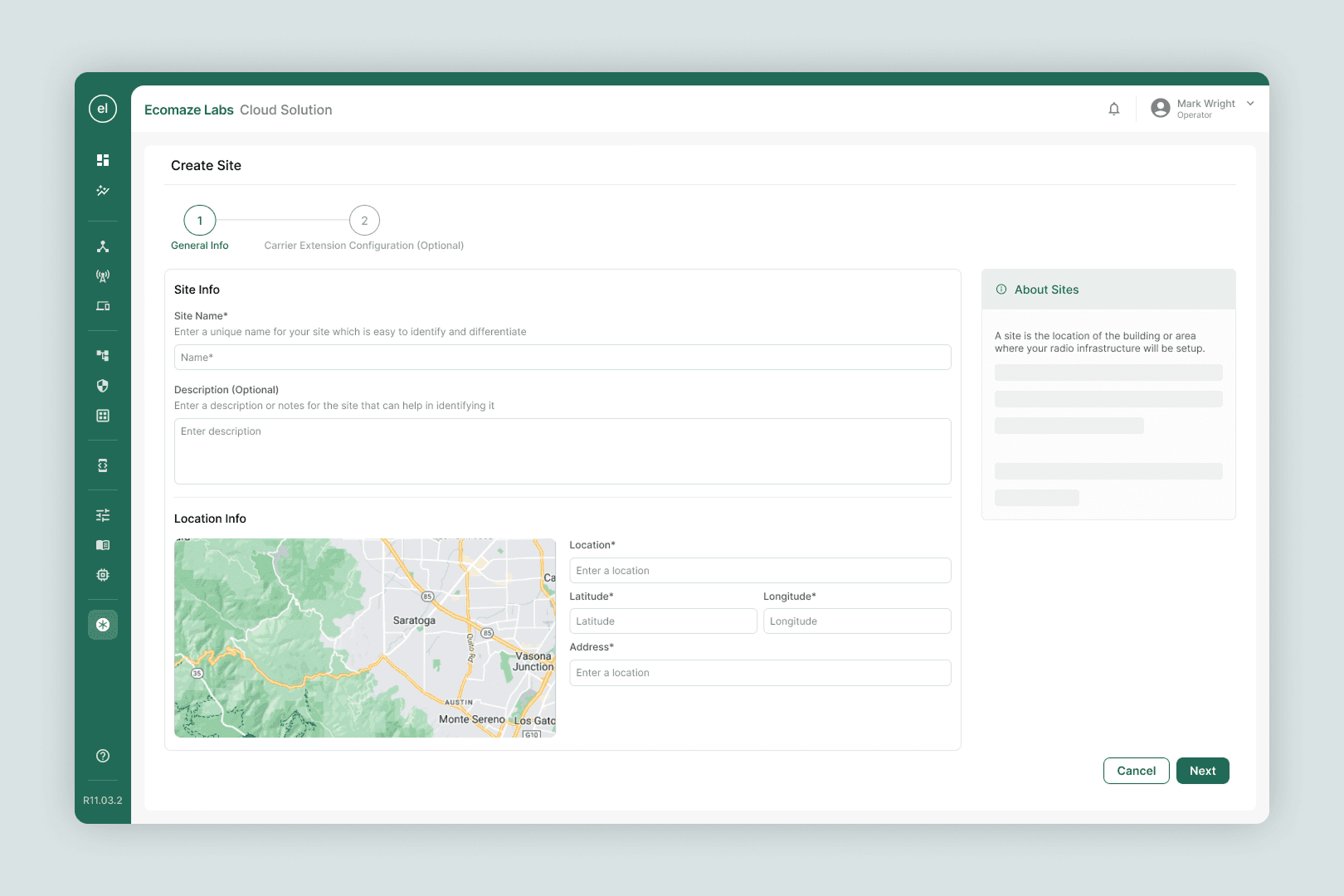
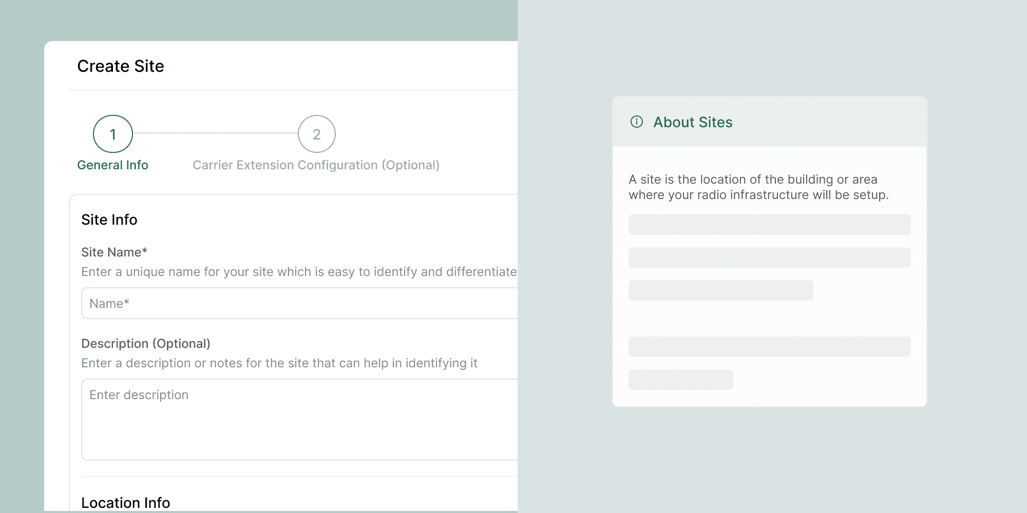
The CTO's instinct was to use a full-screen experience, and the content justified it. Each configuration step involved dense, technical input fields. Squeezing this into a panel would have created cognitive overload. Full-width allowed us to use the right column for contextual definitions and help content, which proved critical for non-technical stakeholders filling out fields without hand-holding.

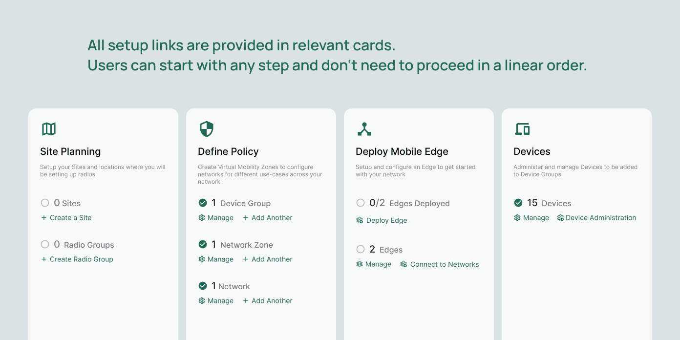
Early wireframes assumed users would move through setup steps in order. During stakeholder reviews, it became clear that enterprise clients rarely have all their infrastructure information at once. Different pieces come from different internal teams. We redesigned the flow to allow non-linear completion, letting users start with the components they had ready and return to incomplete steps later. This was a significant shift from the initial brief and directly addressed a real-world constraint.

The existing product had 8 settings flows. Rather than digitising all of them into the wizard, we worked closely with the Engineering Lead to identify the minimum viable fields required at the onboarding stage. Fields needed post-setup were deliberately excluded. This required pushing back on scope and advocating for the new user's cognitive load over completeness.
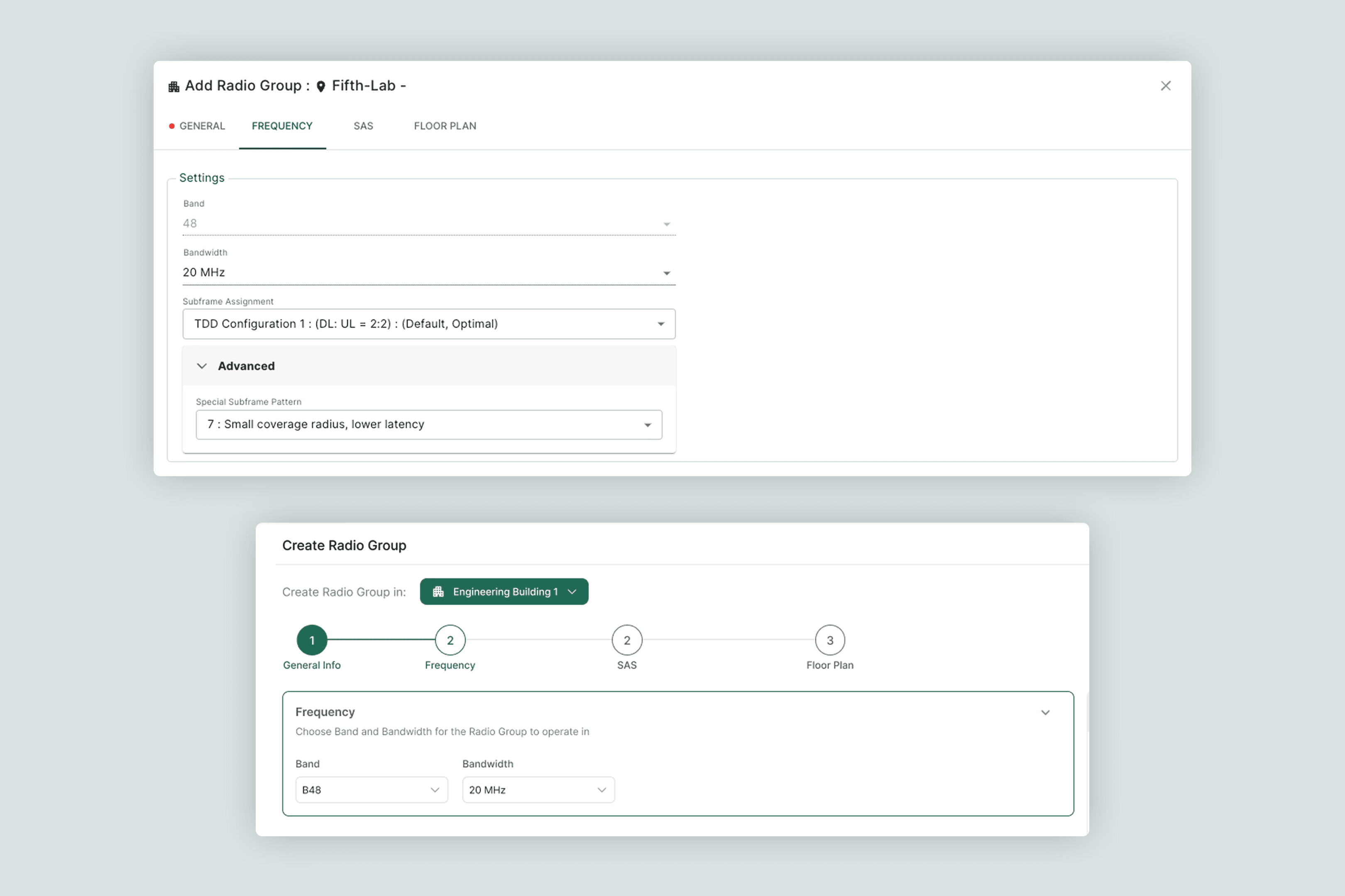
Midway through the project, the Engineering Lead recognised that the wizard's layout was simply better than the existing settings screens. We extended the design system to cover both contexts, so the new layout became the standard across the product. What started as a new-user flow became a broader UI upgrade.
Final Designs
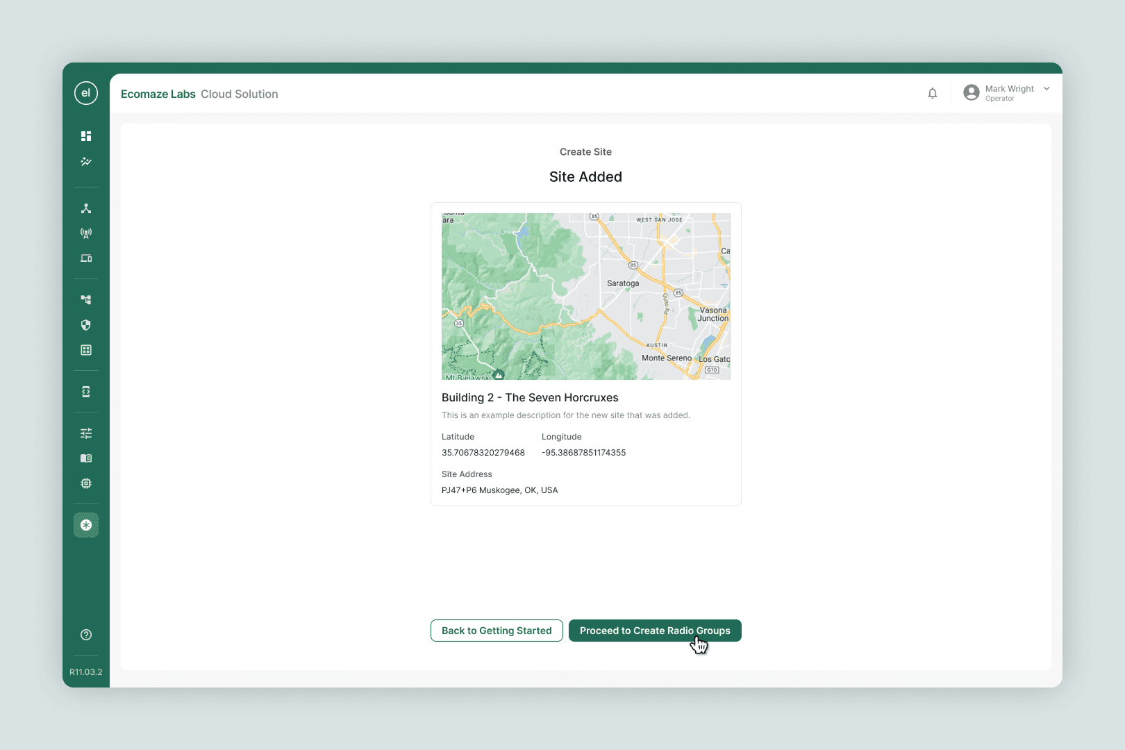
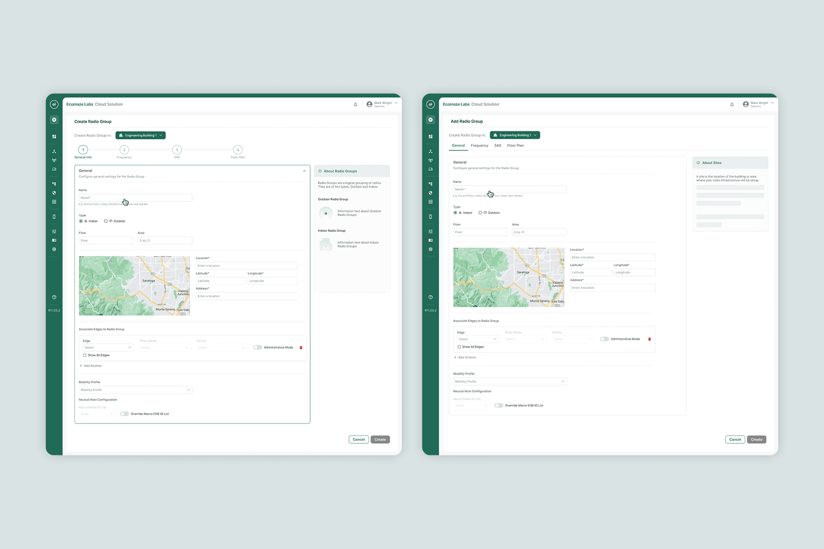
High-fidelity screens covering all 8 configuration flows plus a new device-addition flow. Full-width layout, persistent contextual help, non-linear navigation. The same system later replaced the old settings screens across the rest of the product.