Cutting client onboarding from 4 weeks to a few days
Replacing a manual, multi-team setup process with a flow clients could complete themselves
Client
Cloud-based Network Management Platform
Role
Lead Product Designer
Platforms
Desktop

The Brief
About the Client
Highway9 built a platform that helps enterprises set up and manage private 5G and LTE networks, covering everything from in-building coverage to edge infrastructure. I joined right after they came out of stealth, when they were growing fast.
Challenge
Onboarding a single client onto the platform took anywhere from 5 days to 4 weeks, usually the latter.
Getting a client set up needed coordination between their stakeholders and on-site engineers for details about network infrastructure, bandwidth usage, and device settings, plus Highway9's own Cloud Solution team to complete integration. Setup would often stall due to a lack of context or technical knowledge on the client's side, leaving the team waiting on information before they could move forward.
Growth was accelerating, and it wasn't feasible for the Highway9 team to manually intervene at every stage of setup for every client.
Solution
The brief was simple: build a Getting Started wizard that let clients configure their own network, without needing Highway9's support team every time.
The Process
Mapping out what was needed
The existing method for the onboarding required too many parameters and data points that needed to be input to proceed, a lot of which would not be available with a single stakeholder.
We looked at the existing flows across all the steps and mapped only the essential fields needed for initial onboarding versus post-setup configuration.
This information architecture exercise, done collaboratively with engineering, was the most important foundation of the project. Without agreement on scope, the wizard would have been as overwhelming as the existing process.
Identifying key users and what they need
The key users of the onboarding flow would be IT administrators from the client’s end who would be in-charge of setting up the platform.
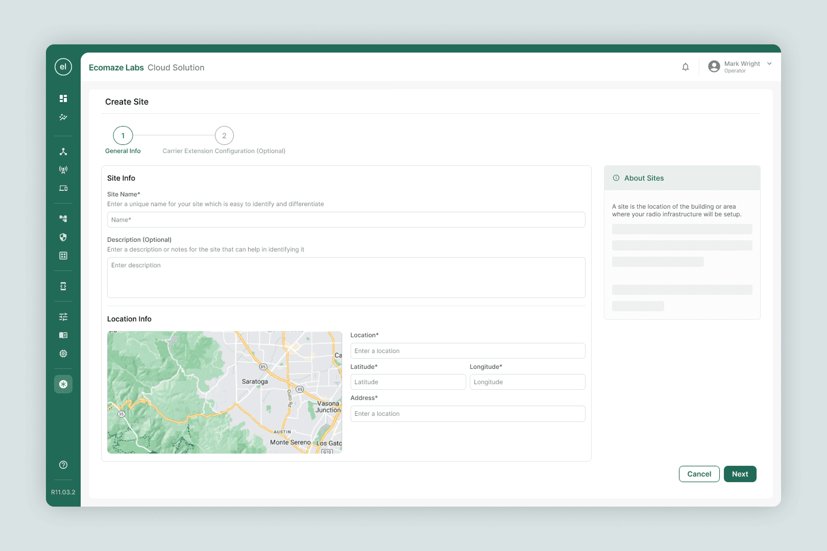
This was the primary persona that was expected to be exposed to the flow we were creating, but it might not be limited to them. These users could know about the network infrastructure but not with the same expertise that someone from the Highway 9 team. Since some of the requirements were too technical, or could be known by a different name, we would have to provide help text, key nomenclature labels and explanations to assist the user.
Key Points
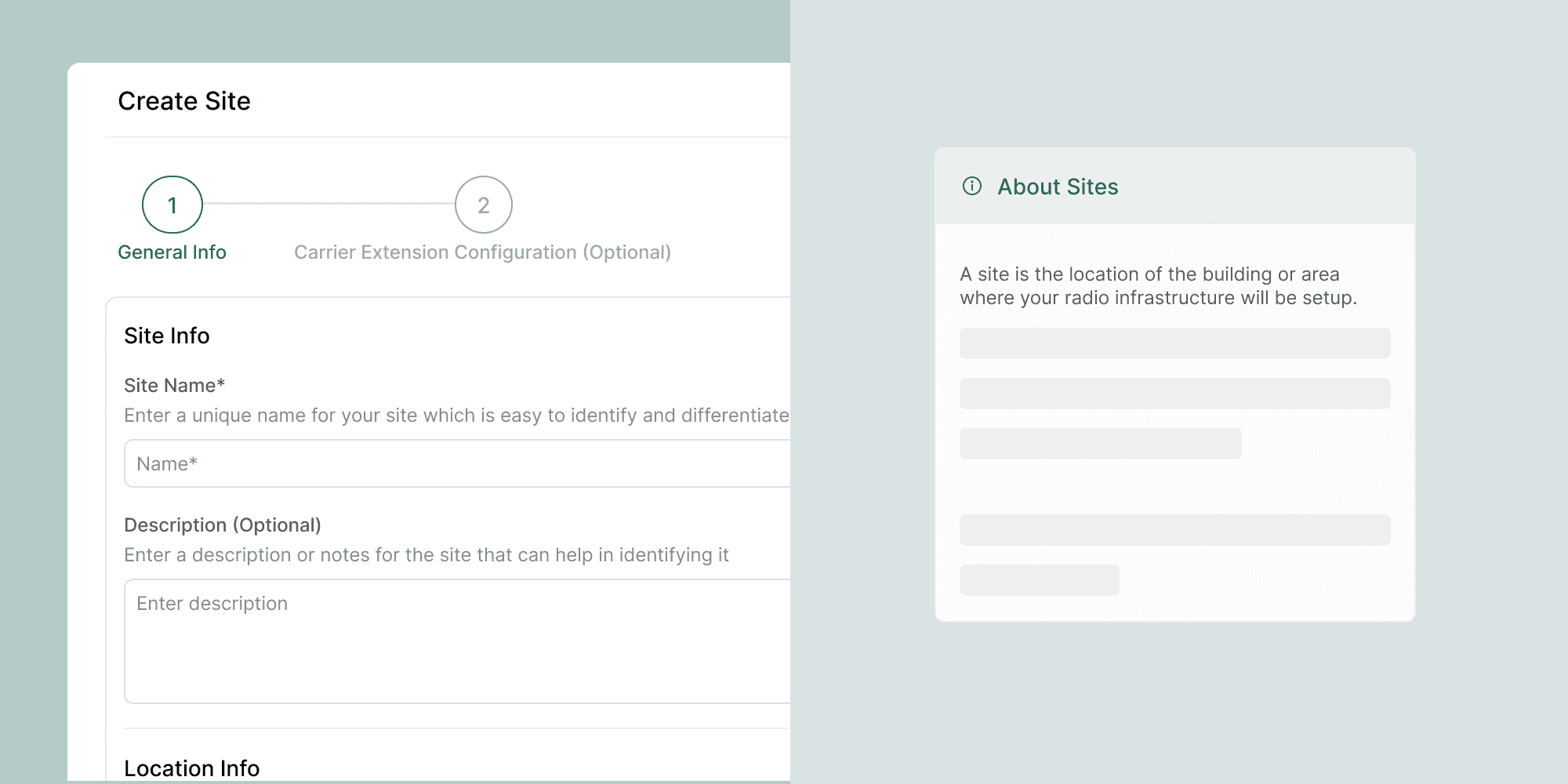
Add help text below fields
Add extra information wherever needed for technical terms, domain knowledge or new flows.
Explorations & Iterations
Making a wizard
Early wireframes explored a wizard format that walked clients through all 8 steps in sequence. Although this was the initial ask, during the first feedback cycles I learned that in practice, enterprise clients rarely have every infrastructure detail on hand at once.
From linear to non-linear
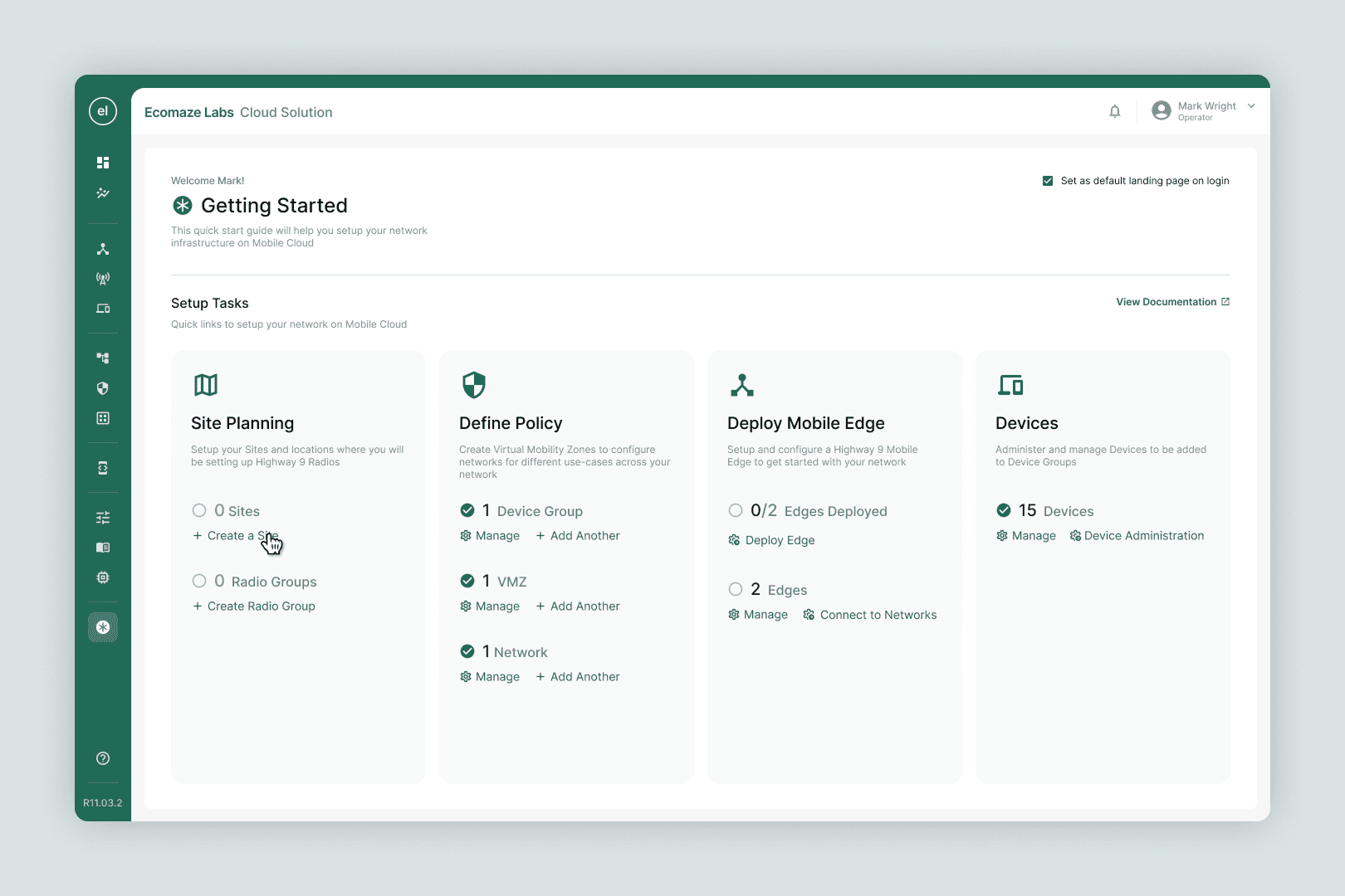
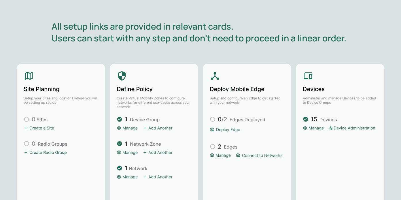
After the finding out that clients rarely have every infrastructure detail on hand, I built the flow around a checklist model instead, so client teams could complete steps in any order and pick up where they left off. Only flows that were dependent on another flows to be completed would be unavailable to start.
Usage of Space
My initial wireframes constrained all the required flows in a section in the centre of the screen, with white space on the sides to enable quick scanning and reduce overwhelm. However, the CTO instead suggested that we utilise the entire screen for the setup process. The extra real-estate was utilised by comfortably including a dedicated panel for contextual help text to explain setup related nomenclature.
Key Design Decisions
The CTO's instinct was to use a full-screen experience, and the content justified it. Each configuration step involved dense, technical input fields. Squeezing this into a panel would have created cognitive overload. Full-width allowed us to use the right column for contextual definitions and help content, which proved critical for non-technical stakeholders filling out fields without hand-holding.

Early wireframes assumed users would move through setup steps in order. During stakeholder reviews, it became clear that enterprise clients rarely have all their infrastructure information at once. Different pieces come from different internal teams. We redesigned the flow to allow non-linear completion, letting users start with the components they had ready and return to incomplete steps later. This was a significant shift from the initial brief and directly addressed a real-world constraint.

The existing product had 8 settings flows. Rather than digitising all of them into the wizard, we worked closely with the Engineering Lead to identify the minimum viable fields required at the onboarding stage. Fields needed post-setup were deliberately excluded. This required pushing back on scope and advocating for the new user's cognitive load over completeness.
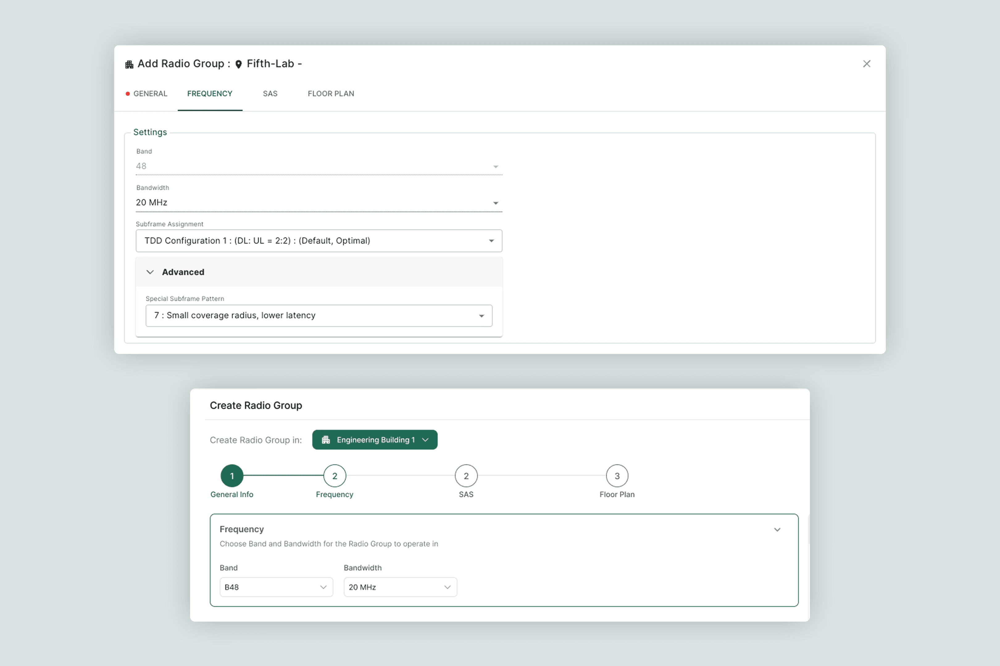
Midway through the project, the Engineering Lead recognised that the wizard's layout was simply better than the existing settings screens. We extended the design system to cover both contexts, so the new layout became the standard across the product. What started as a new-user flow became a broader UI upgrade.
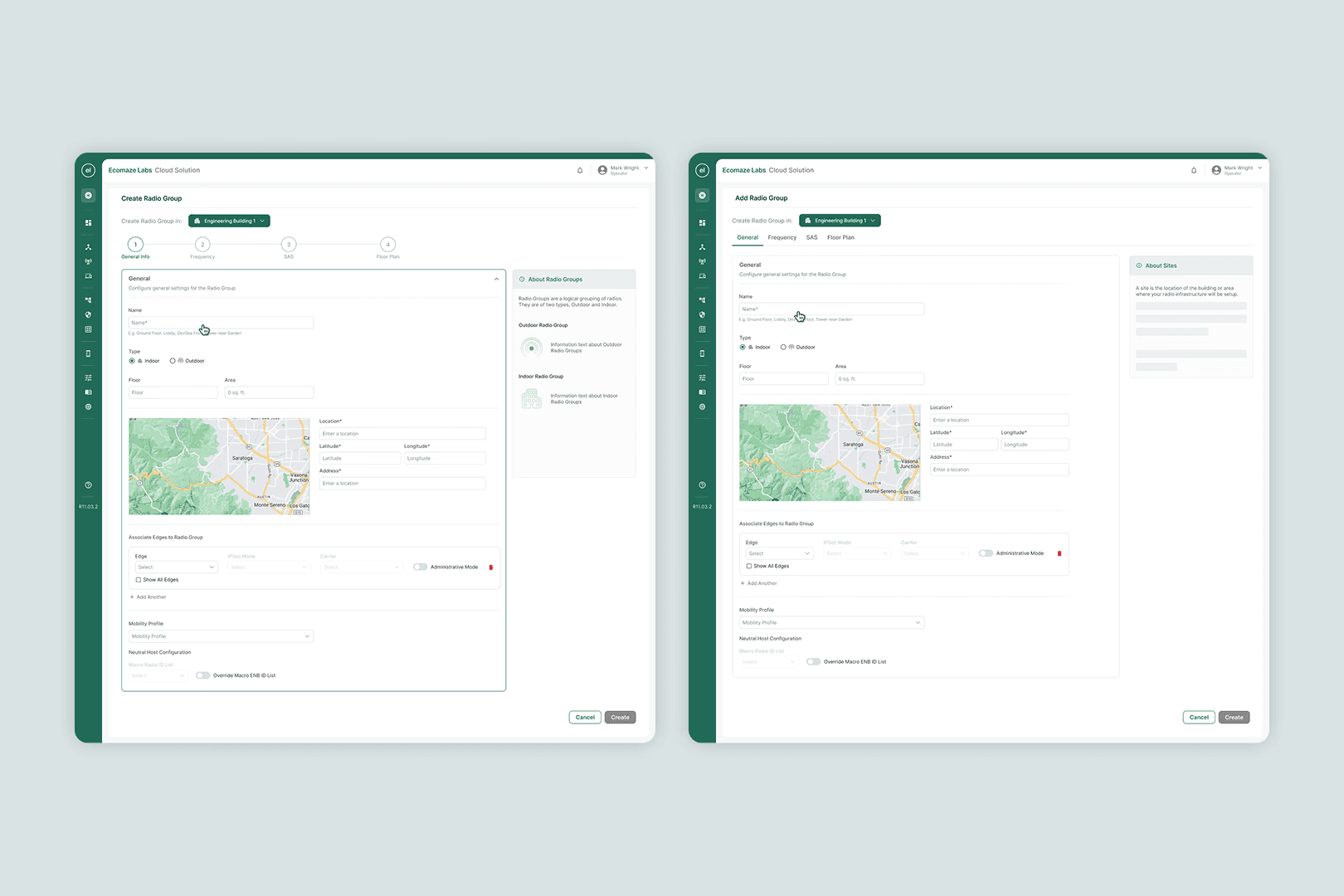
Final Designs
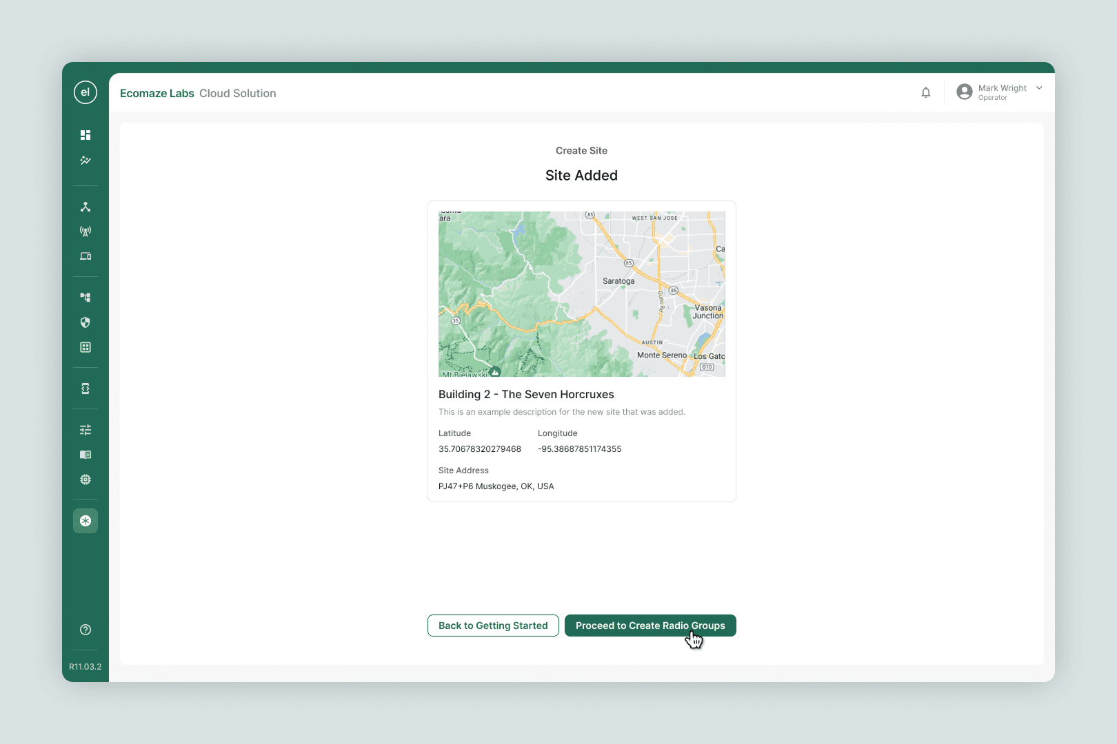
High-fidelity screens covering all 8 configuration flows plus a new device-addition flow. Full-width layout, persistent contextual help, non-linear navigation. The same system later replaced the old settings screens across the rest of the product.